Portfolio

Book covers, and the thinking behind them

Six fictional book concepts exploring literary fiction, adventure, romantasy, cosy mystery, historical fiction and speculative stories. AI-assisted sample artwork, not client commissions.

How to read this page

Every cover starts as a question

None of these covers began with an image. They began with a question: what does a reader need to understand in the two seconds before they scroll past? The answer decides the colour, the crop, the typeface and how much space the title is given.

The notes below each plate follow the same four points — brief, direction, typography, suggested formats — so you can see the reasoning rather than just the result.

The Quiet Kingdom — concept book cover

Concept artwork · Not a published client project

Literary fiction

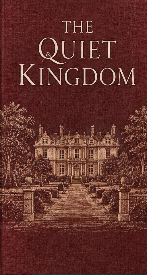
The Quiet Kingdom

The brief
A generational novel about a house that outlives its family. The author wanted something restrained that wouldn't be mistaken for historical romance.
The direction
A single architectural motif, deeply desaturated, with the title given the whole upper third. Burgundy cloth tones suggest age without leaning nostalgic.
Typography
High-contrast serif for the title, widely tracked sans for the author name — a deliberate century-apart pairing.
Suggested formats
Paperback wrap, hardback jacket with flaps, ebook cover, audiobook square.
The Farther Tide — concept book cover

Concept artwork · Not a published client project

Adventure / speculative

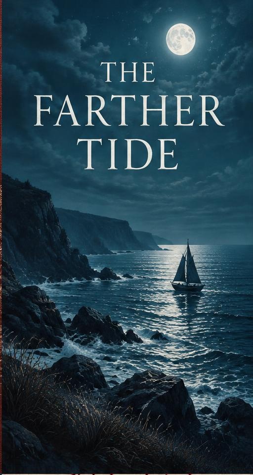
The Farther Tide

The brief
A seafaring novel with a melancholy heart. It needed scale for the adventure readers and quiet for the literary ones.
The direction
Moonlit coastline cropped tight so the horizon sits low, leaving a broad navy field for type. The single light source does all the emotional work.
Typography
Airy centred serif with generous letterspacing, so the title feels like distance rather than shouting.
Suggested formats
Paperback wrap, ebook cover, three social reveal crops.
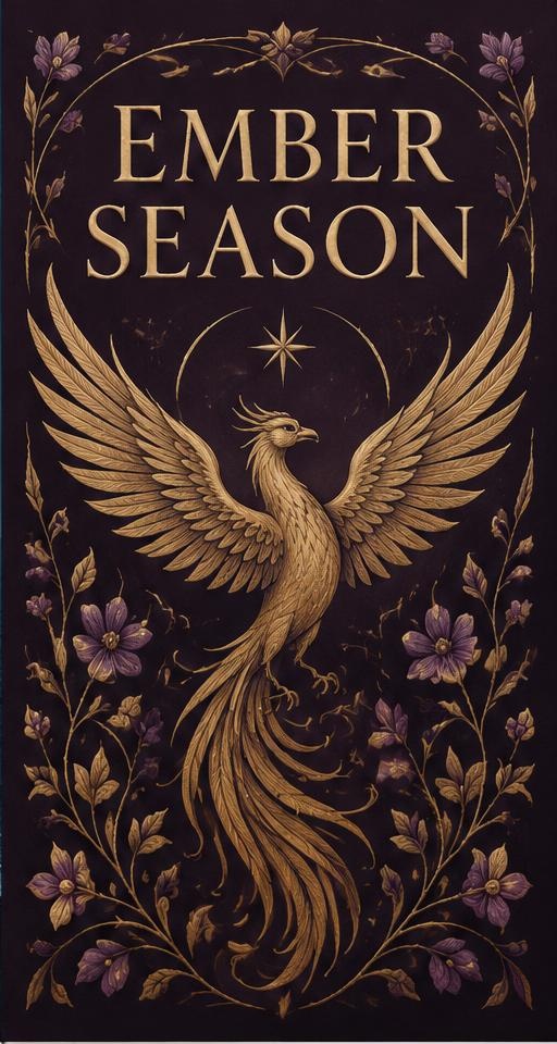
Ember Season — concept book cover

Concept artwork · Not a published client project

Romantasy series

Ember Season

The brief
Book one of a planned trilogy. The system had to flex for two future titles with different elemental themes.
The direction
An illustrated emblem locked in a fixed frame, with only the accent colour and central motif changing between books.
Typography
Decorative display capital for the first word, neutral serif beneath — keeps series recognition without repetition.
Suggested formats
Series style guide, book one full wrap, spine template for books two and three.
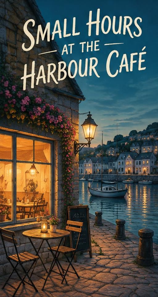
Small Hours at the Harbour Café — concept book cover

Concept artwork · Not a published client project

Cosy mystery

Small Hours at the Harbour Café

The brief
Warm, low-stakes mystery for a series-hungry audience. Needed to read instantly as cosy, not thriller.
The direction
Illustrated scene with a lit window, bright accent palette, and a gentle curved title arc — every convention the shelf expects, executed cleanly.
Typography
Rounded hand-lettered title with a small-caps series line above it.
Suggested formats
Paperback wrap, ebook cover, series badge, matching newsletter header.
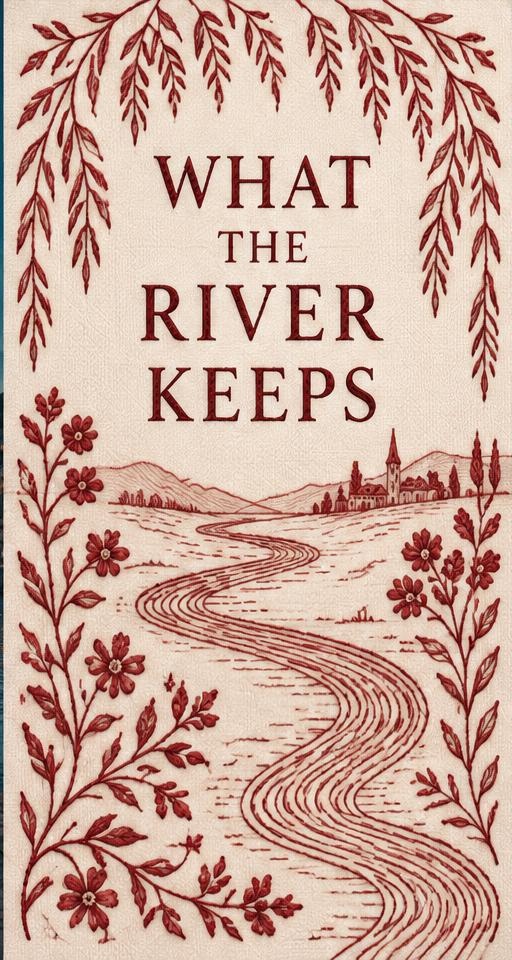
What the River Keeps — concept book cover

Concept artwork · Not a published client project

Historical fiction

What the River Keeps

The brief
Dual-timeline novel set across two centuries. The cover had to signal period without looking like a museum catalogue.
The direction
A textured paper ground with a single embroidered motif and gold foil detailing indicated in the print spec.
Typography
Engraved-style serif with old-style figures for the date subtitle.
Suggested formats
Hardback jacket with foil spec sheet, paperback wrap, ebook cover.
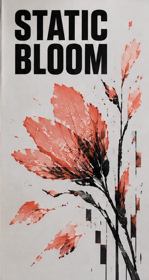
Static Bloom — concept book cover

Concept artwork · Not a published client project

Speculative / near future

Static Bloom

The brief
Short story collection with a fragmented structure. The author wanted something that felt unsettled but still elegant.
The direction
Type as the image — the title broken across a grid, misaligned by a few degrees, on a flat ivory field.
Typography
Grotesque sans in a single weight, disrupted by scale shifts rather than decoration.
Suggested formats
Paperback wrap, ebook cover, six matching story cards.

Also delivered

The files behind every cover

A cover isn't finished until it's correct at the printer and at the retailer.

Print-ready wrap

CMYK PDF with bleed, crop marks and a spine width calculated from your final page count and paper stock.

Retail-ready ebook

RGB JPG at retailer specification, tested for legibility at thumbnail scale on light and dark backgrounds.

Promotional crops

Square, portrait and landscape versions plus a transparent 3D mock-up for your website and newsletter.

Charlotte Reads/Creative

Your cover could be the next plate on this page

Tell me the genre, the page count and your release date and I'll come back with availability and a quote.