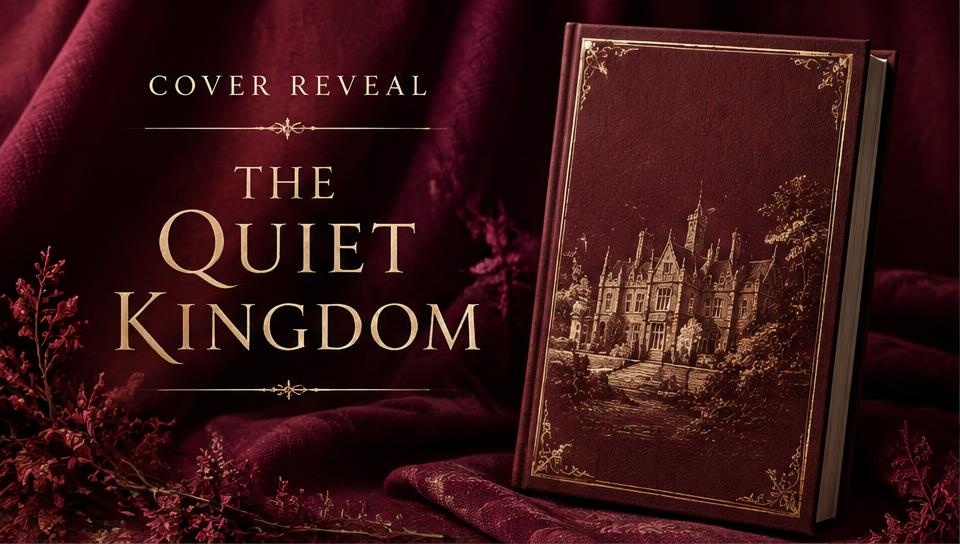
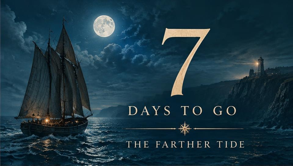
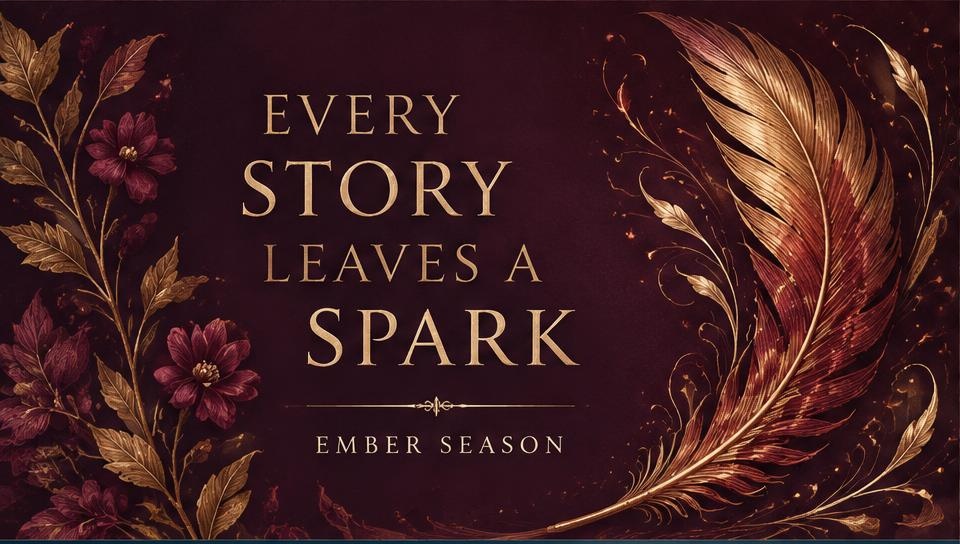
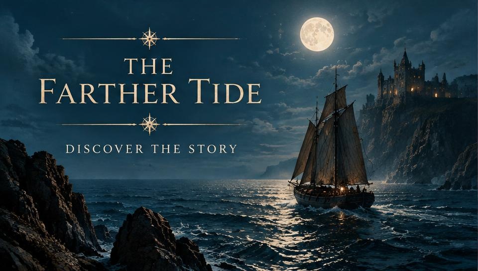
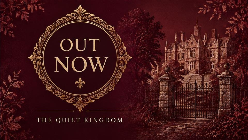
A reader rarely buys on first sight. They see the cover, then a quote card, then a countdown, then a friend's post — and somewhere in that sequence the book becomes familiar enough to try. That only works if all those pieces look related.
So promotional work is designed as a system: one grid, one type scale, one palette drawn from your cover, and a small set of rules for how they combine. Adding a new graphic three months later takes minutes instead of starting over.
Every piece is built at the correct size for its placement, with safe zones for interface overlays, so nothing important disappears behind a profile photo or a swipe prompt.